e-Commerce Mobile App for a Trendy Florist Case Study
Role: UI & UX Design
Tools: Figma
Year: 2022
Project Overview
The Product:
Georgette’s Flowers is a local florist that sells bouquets at reasonable prices and allows customisation when customers call in to place an order. A florist app that allows users to customise bouquets that truly meet their gifting needs. Georgette’s Flowers app targets busy customers like workers who want the flexibility of finding flowers that would suit an occasion easily.
The Challenge:
Flowers are the go-to gift for many occasions where words don’t quite express our feelings, such as romance, farewells, graduations, get well soon and bereavement. However the customer experience is often less than desired, with many customers feeling unsatisfied with their purchase. We hope to manage users expectations give them the ability to buy what they are looking for and assurance that they are making an informed choice.
The Goal:
1. Give users delivery flexibility
2. Customisation of bouquets
3. Save users more control over time and money
My role:
UX designer and UX researcher, designing an app for Georgette’s Flowers from conception to delivery.
Responsibilities:
User research and interviews, paper and digital wireframing, low and high-fidelity prototyping, conducting usability studies, accounting for accessibility and iterating on designs
User Research
Summary
I conducted a competitive audit report of 3 competitors to understand their offerings to customers, their strengths, weaknesses, and what our opportunities and weaknesses are. And what we can offer that sets Georgette’s Flowers apart from them.
I also interviewed frequent florist customers to understand their pain points.
The research confirmed my initial assumptions about purchasing bouquets online, but also shed light on the lack of flexibility when it came to online bouquet purchases and a lack of transparency due to the seasonality of flowers.
Pain points
1. Time consuming research
Having to spend a lot of time researching what types of bouquets are most appropriate for different occasions.
2. Lack of customisation options
There are not many customisation options for bouquets, such as paper, ribbons, colour type.
3. Pictures are not representative
Bouquets are dependent on seasonal flowers and pictures are a rough estimation of what bouquets will look like.
4. Lack of click and collect options
Picking up bouquets are only during the florist’s business hours, which are usually during work hours.
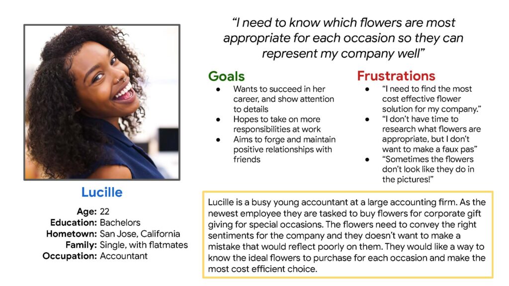
Persona: Lucille
Problem statement:
Lucille is a junior employee tasked to buy flowers who needs an easier way to choose flowers that are specific to her company and the recipient’s needs, because doing in depth research is time consuming and not a good use of her time.
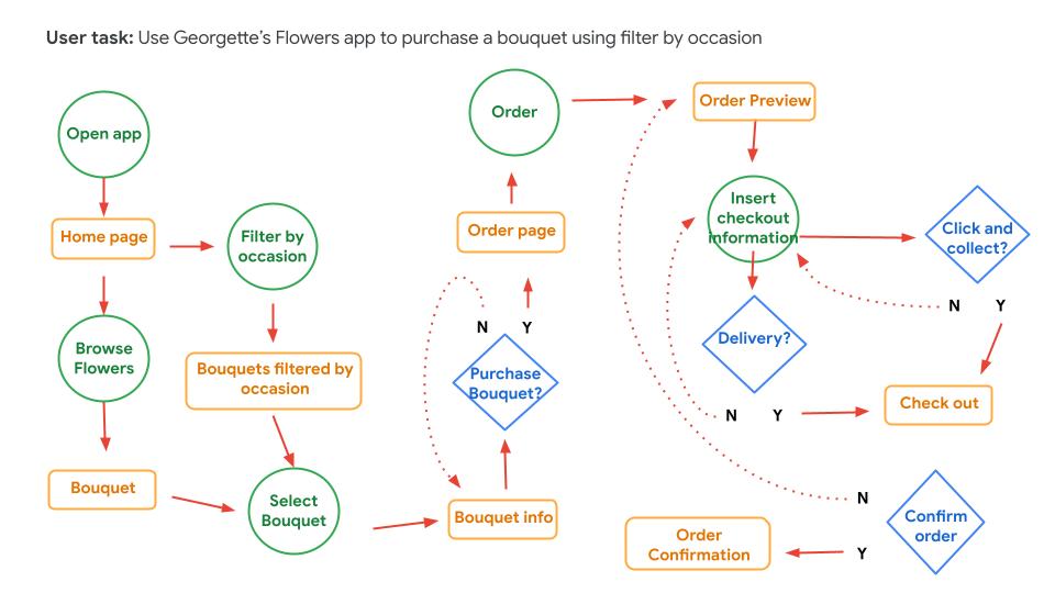
User Flow
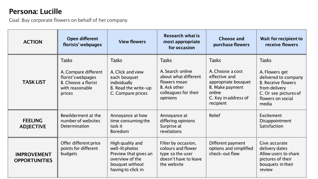
User Journey Map
Mapping Lucille’s user journey revealed how useful it would be for users to have clarity and flexibility when purchasing flowers.
Design
Paper wireframes
Quick sketches of early wireframes, exploring the different screens of the app, with a focus on what would be most understandable to the user.

Refined Paper wireframes
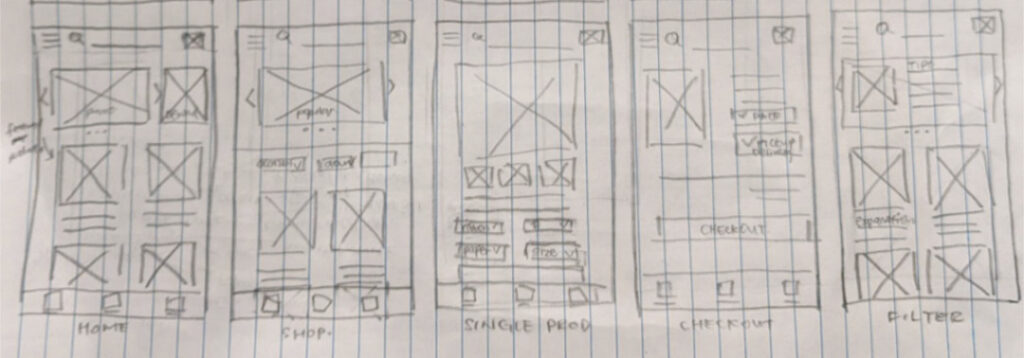
Digital Wireframes
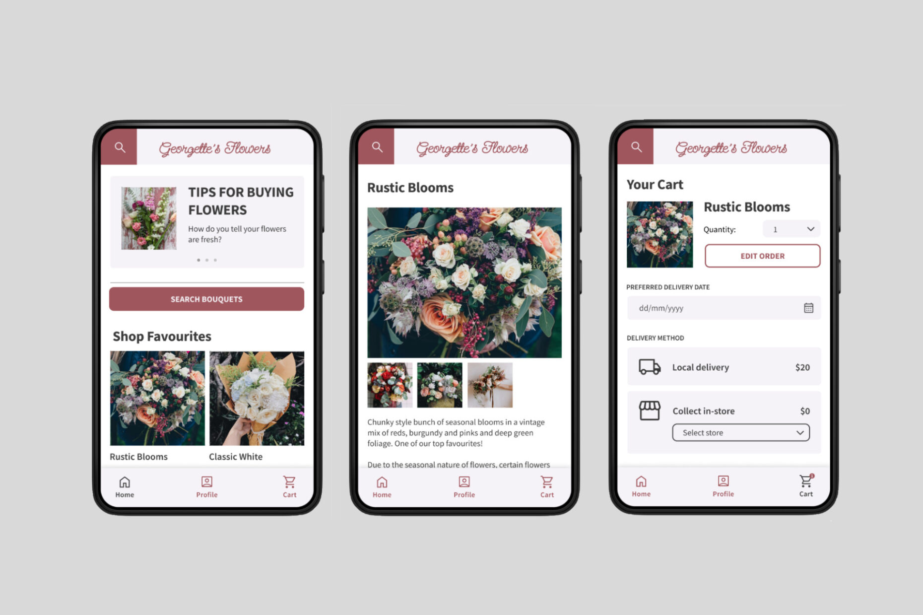
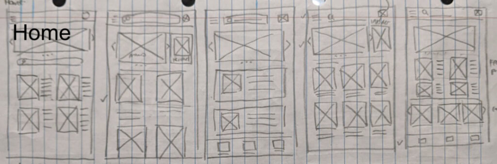
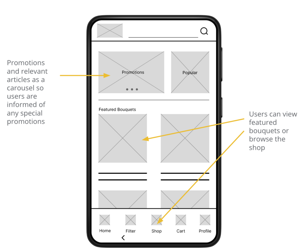
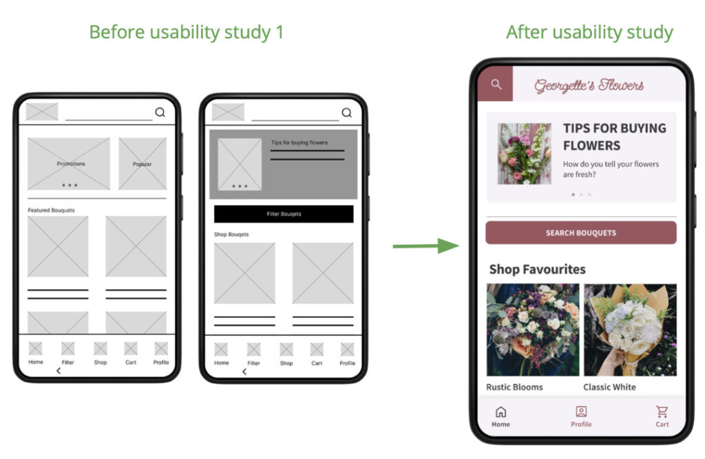
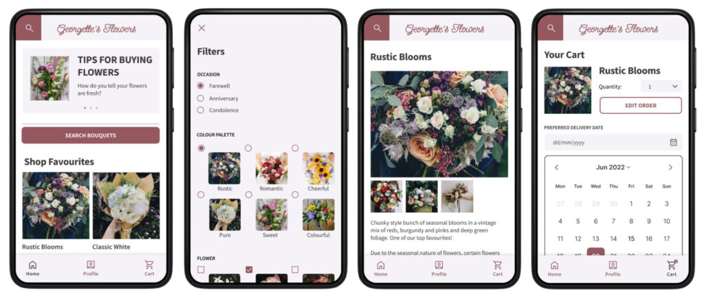
Home Screen
Home Screen would have promotions and relevant articles about choosing bouquets as a carousel on top. There is an additional filter button to highlight to users of other options to find bouquets.
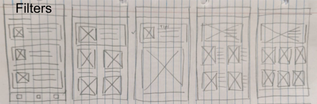
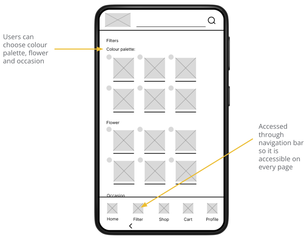
Filter Page
Filter page allows users to save time while searching for a specific style of bouquet depending on their needs.
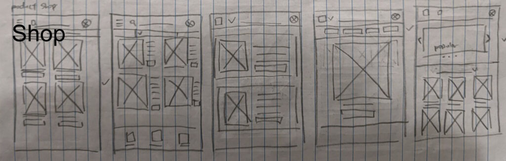
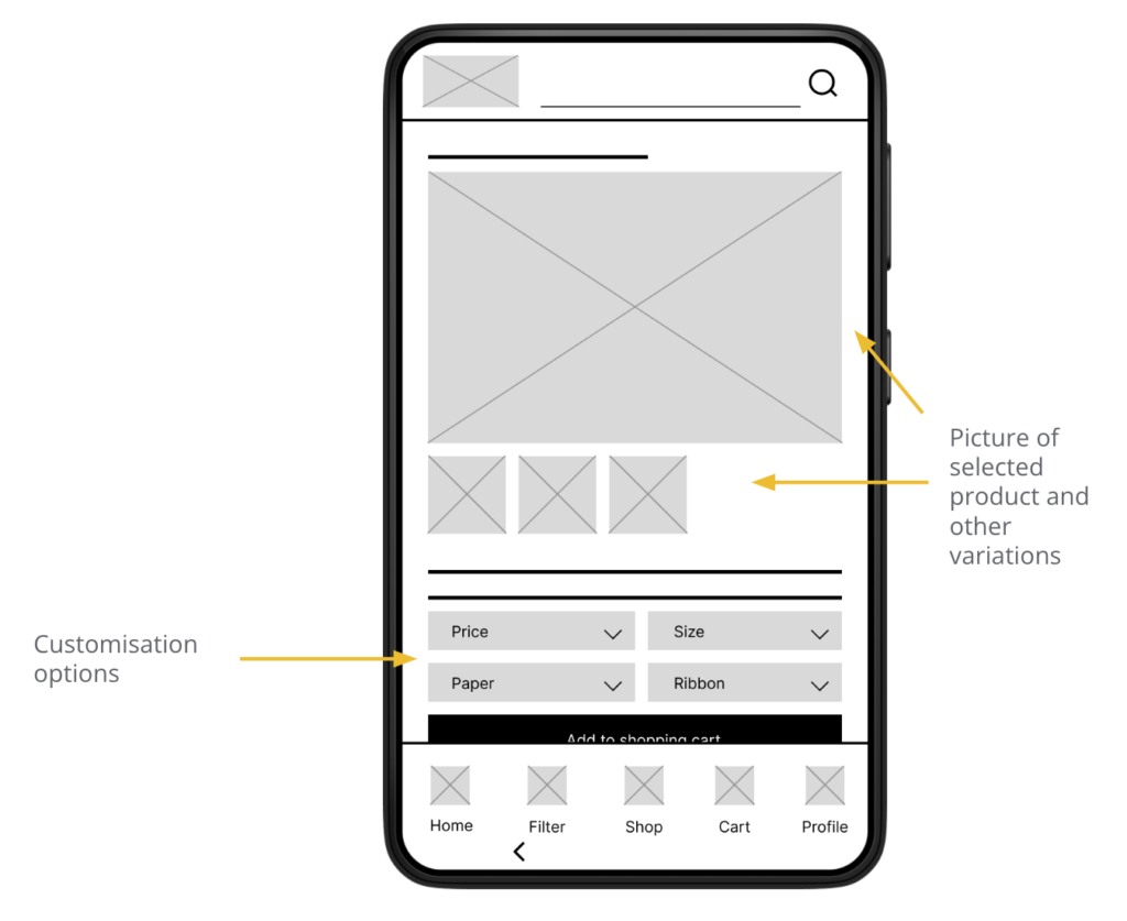
Single Product Page
Single Product Page showcases the selected bouquet and other possible variations. Customisation options are also available so the user has more flexibility.
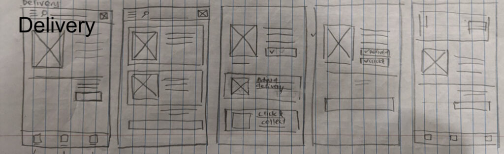
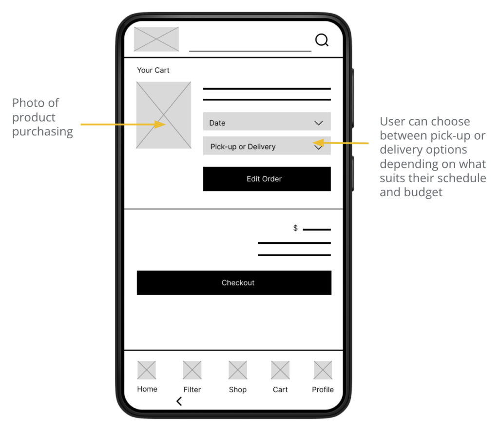
Checkout Page
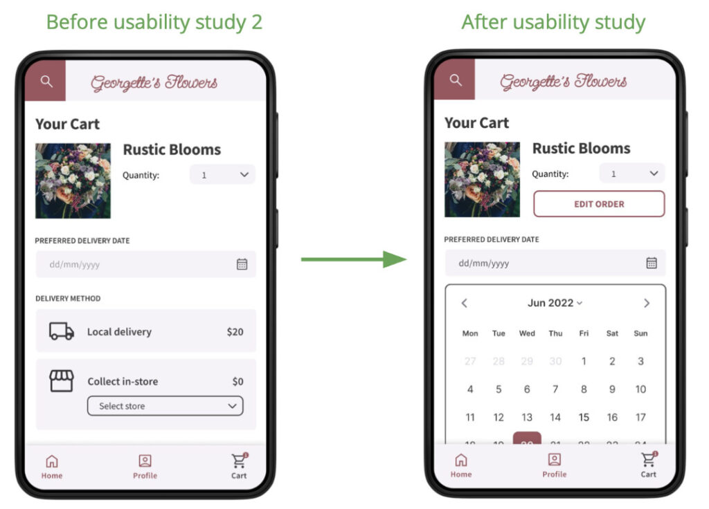
Checkout page has a photo of the bouquet the user wants to purchase, and date and delivery method as flowers are often time sensitive purchases.
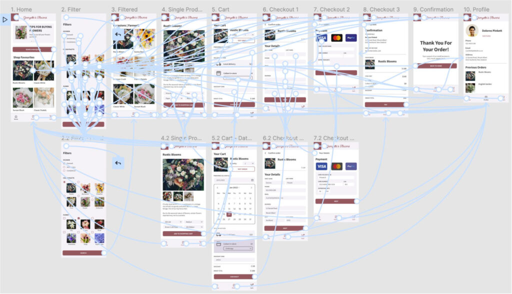
Low-fidelity prototype
The user is able to shop for flowers in two ways, browsing through the catalogue and using the filter function. In the single product page the user can customise their bouquet.
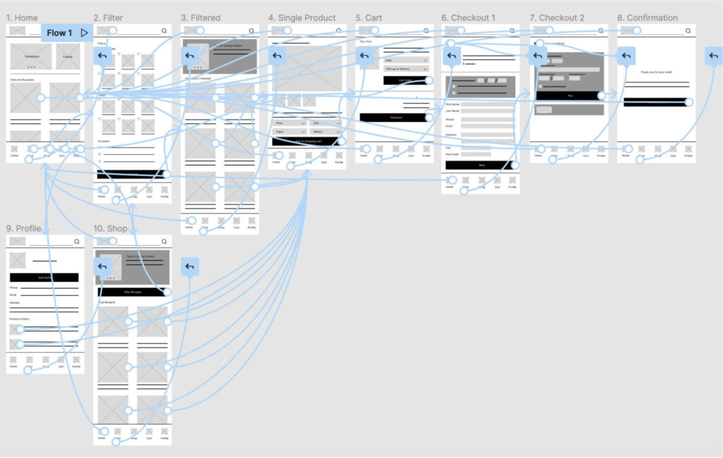
View Georgette’s Flowers’ Low-fidelity prototype
Usability study: findings
I conducted two remote Unmoderated Usability Studies with 5 participants each round, with each session will last 10-15 minutes, based off a series of prompts followed by a SUS after.
Round 1 findings
- Difficulty in accessing the filters
- Navigation menu is not easy to find
- Some participants were confused about the difference between the shop and home page
Round 2 findings
- More forms need to be functional to give a fuller experience
- Navigation menu is easily accessed
- Design is straightforward and intuitive
Refining the Design
Mockups
In the original design, there were five buttons on the button navigation bar. Participants reported difficulty finding the filter and profile button. I decided to simplify both navigation bars, the filter was renamed search recognisable and moved it to a more prominent location. I also combined shop with home, resulting in an uncluttered navbar.
The delivery date and method are easier to see and recognisable icons aid understanding of what options mean.
Final Design
High-fidelity prototype
The final High-fidelity prototype has a more streamlined user flow, and uncluttered navigation so everything is easily accessed. It allows for customisation and has a range of delivery options.
View Georgette’s Flowers’ high-fidelity prototype
Accessibility Considerations
- Important text are at least AA compliant. Colour contrast is high enough for users who may have difficulty seeing. Text is readable in monochrome settings.
- Used icons to help non-native speakers understand what buttons represent, with text also present. Used simple and familiar language whenever possible.
- Used consistent navigation and components so users with low cognition do not have difficulties finding their way around the app.
Going Forward
Takeaways
Impact:
Users have found that the design of the app is straightforward and intuitive and appreciated the ability to customise bouquets.
What I learned:
When designing Georgette’s Flowers App, I learnt to iterate as much as I can as early as possible and not jump straight into mockups, as this will save me valuable time. I also learnt that usability studies are very helpful in uncovering blind spots in my design, and made a huge difference in my iterations.