e-Commerce Website for a Garden Centre Case Study
Role: UI & UX Design, Full Stack Developer
Tools: Figma, Flask, Python, mySQL, Bootstrap
Year: 2023
Link: https://garden-centre.amandiewang.com/
The Company
Cromwell Garden Centre is an online company based in Cromwell, Central Otago that sells and delivers plants, trees, and gardening supplies. They are a New Zealand owned company that stocks a large number of native species. The business is operated by a small, dedicated team.
The Challenge
The client’s current website is outdated and cannot cope with the increased number of products, customers and staff members. The company also has difficulties encouraging returning customers and inspiring customer loyalty.
Staff have also given feedback that the old system is hard to navigate and as a result, it is challenging to understand how the overall business is doing.
Project goals
- A revamped navigation system that allows the categorisation of products for customers to easily navigate to their desired product
- To attract customers and increase customer loyalty, we want to build a system that gives internal users the ability to promote products or product categories through discounts and promotions, and implement a points-based reward system.
- Dashboards for Staff, Managers and System Administrators give them appropriate information about sales and business at their fingertips.
- Timely reports that show Managers and System Administrators the performance and sales of products.
My Role
UX designer, UX researcher and Full Stack developer designing and building a webapp for Cromwell Garden Centre from conception to delivery in a group of 5.
Tech Stack
Flask Python framework, HTML, CSS and JavaScript using Bootstrap framework.
Users
- Visitor
- Customer
- Trade Customer
- Staff
- Manager
- System Admin
GUI Design
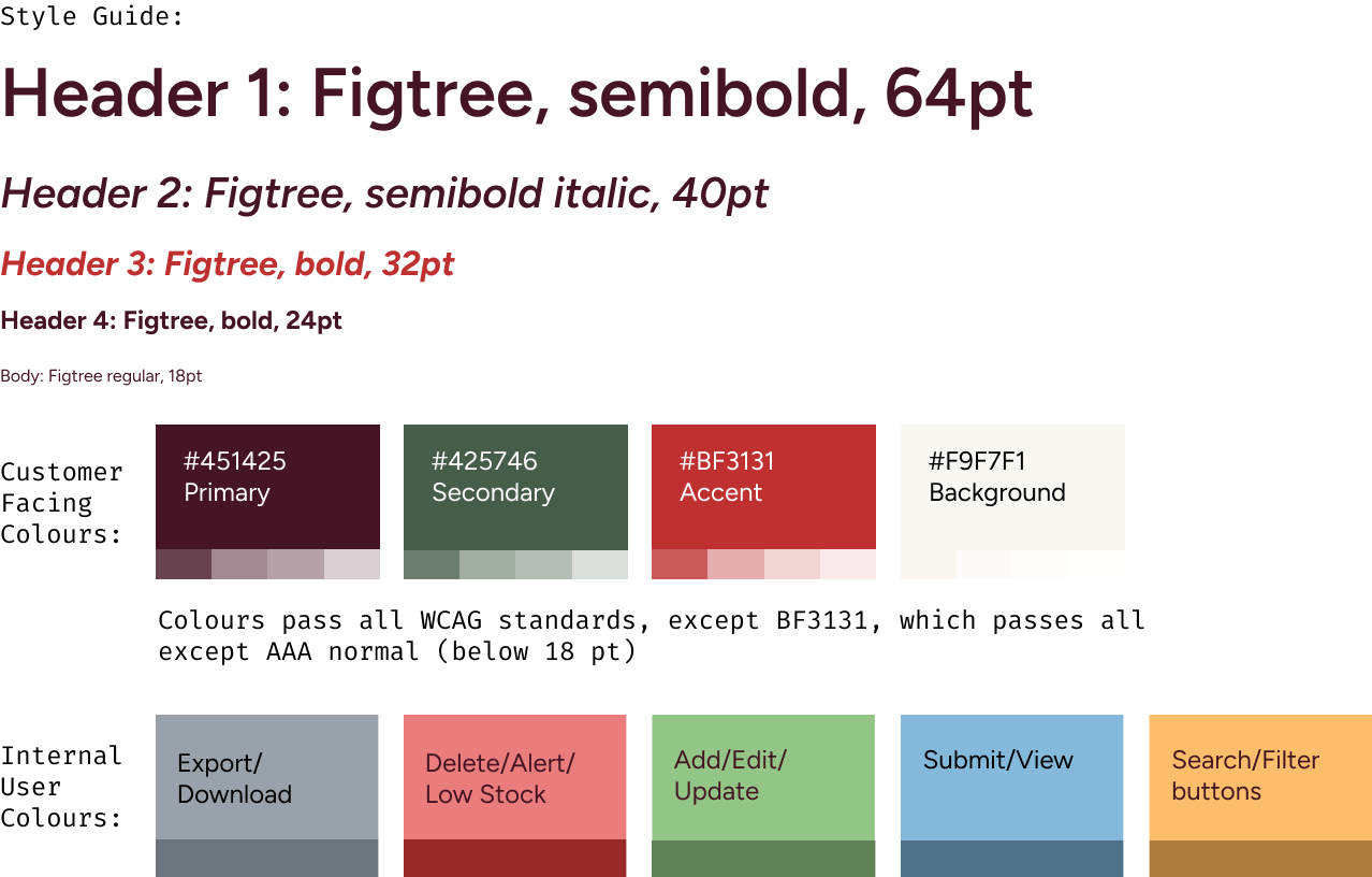
I decided on a branding and style guide in the project planning stage that would keep internal and customer facing interfaces cohesive, yet distinct from each other.
Branding colours were chosen for a warm earthy feel, while Internal User buttons were used a springtime palette. Internal User buttons were colour coded for ease of use and maximum efficiency.
Initial Design on Figma
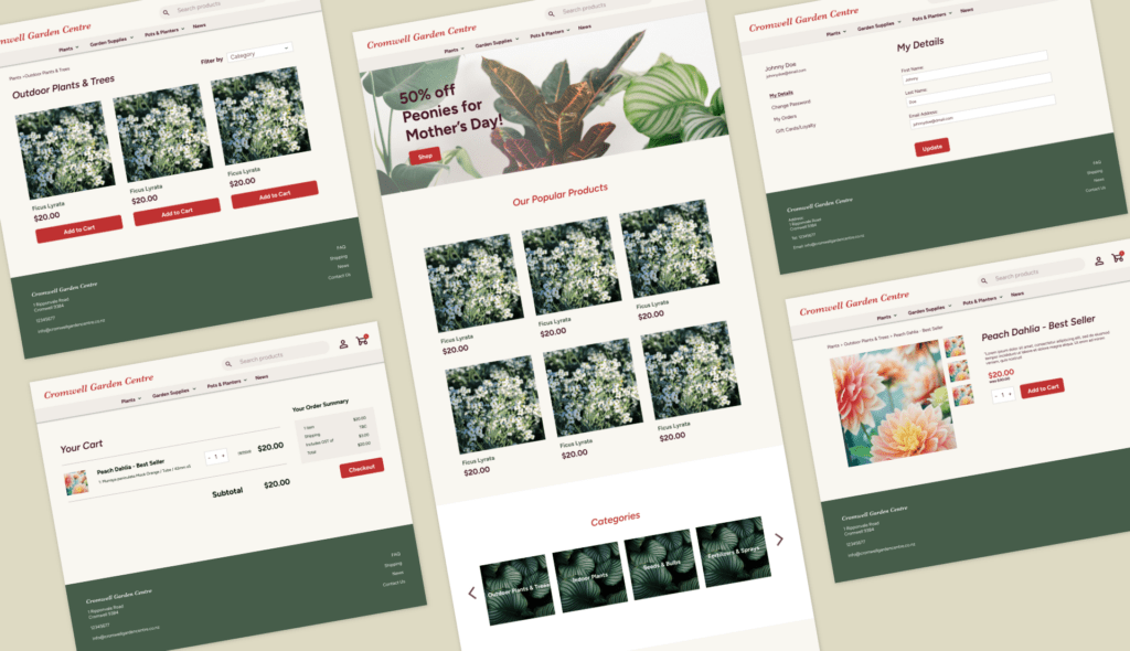
I was quite happy with my initial design but in the implementation stage, some features proved to more of a challenge to implement as a developer than expected. I had to be flexible with my ideas and create work arounds where needed.
Overall, most elements were kept, but as I was also working as a developer on this project, I was able to keep tweaking the UX when I and the team found better ways of doing things.
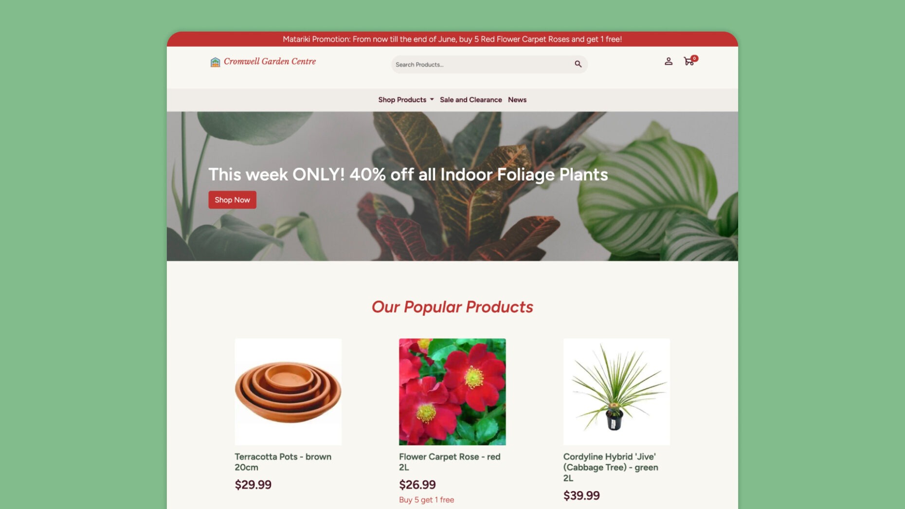
Final Design
Overall layout of the interface.
The grid system was used the most commonly on the website to organise content heavy pages, especially those with a mixture of different types of content, such as the homepage, product details, dashboard, shopping cart and checkout pages. This allowed the page to remain uncluttered, letting users scan it efficiently.
We used a lot of images for customer facing parts of the website to make it look inviting and lively, and where space was limited, carousels were used to display images.
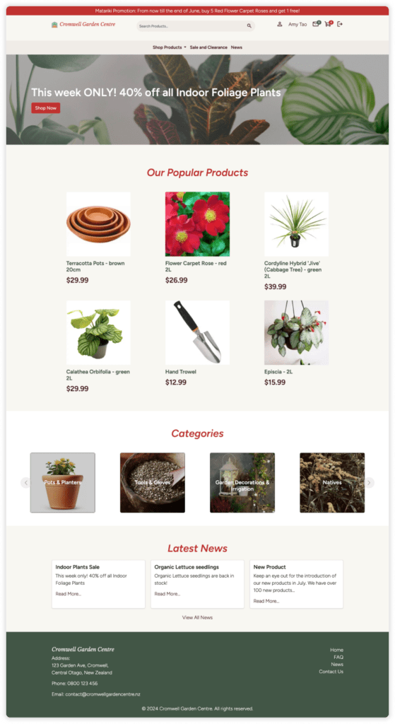
A mixture of cards and catalogue style pages were used to display products with photos, names and prices. Call to action buttons on the customer facing pages and promotions and discounts were also highlighted in red to draw the user’s eye.
Dashboards and reports used a multi-panel layout to contain complex but important information. The icon for the staff member was a fun touch of personality added which also served the practical role so staff users know what role they are logged into.
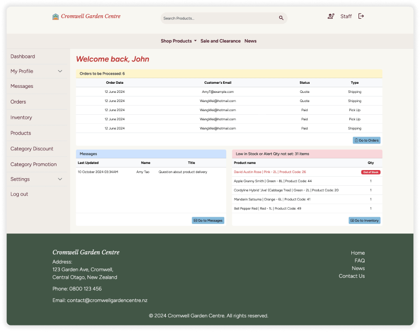
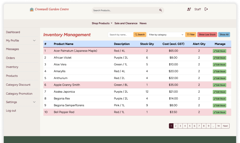
A tabbed layout was used when there was a lot of information to manage, such as the edit product page and message centre, to increase functionality.
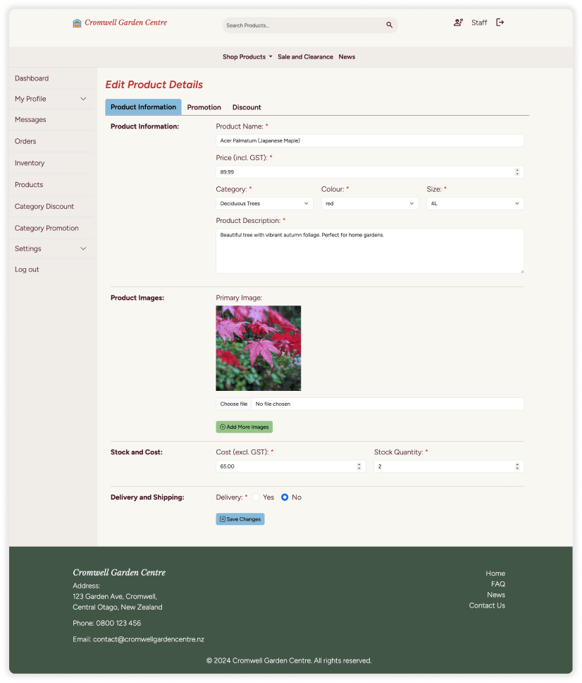
Tables were used for internal users to manage settings, products, or people. Tables with a lot of content had pagination, search functions and filters to prevent clutter. As there were a lot of buttons in and surrounding tables, we opted to colour code them to increase user efficiency.
Summary
What I learned:
This experience helped me to see things from a developer’s perspective and appreciate better what features are more challenging to execute, and what I can do as a designer to provide more clarity. Working in the Agile methodology allowed us to catch issues early on and fix them.