Data collection and record keeping system for non-profits
Role: UI & UX Design, Webapp Development
Tools: Figma, React.js, JavaScript, Supabase, Tailwind (Flowbite)
Year: 2024
Project Overview
The Product:
The case study chosen is a charity in Canada. The organisation collects consignment quality, high-quality donated clothes for children from the public. They work with refugee organisations and public schools to provide vulnerable and at-risk children with the clothes they need to feel comfortable and at ease in their own skin.
I translated it into an Auckland, New Zealand context (where I am based). Times are in NZT and seasons reflect the South Hemisphere’s.
At this stage the product is an MVP meant to demonstrate matching between donations and recipient requests.
It is not meant to be a stand-in for an organisation’s webpage, but an add-on to their main webpage.
The Challenge:
Non-profits want to make a real difference in their chosen cause, but this often means neglecting to streamline processes due to costs and time involved. This results in many charities are not fully utilising new technologies in their processes. For example, some organisations may require you to download a docx form, fill it up and email it back to the organisation. Similarly, data is often kept on excel sheets instead of being integrated into a system. As a result, records may stored in hardcopy files which take up precious space and can get misplaced, lost or destroyed.
Few charities also have the resources to hire a tech person on staff, therefore the system must be as simple and user friendly as possible for non-technical users to understand quickly.
Requirements:
- An easy-to-use system that steamlines processes
- Record keeping functionalities that track recipients and stock
- Records what and when items were given out
- Fully responsive design
My role:
Sole UX designer and UX researcher, and developer
The Users
Admin:
Staff from the charity who will need access to the admin functions to send emails or call contacts, monitor stock and requests.
Volunteers:
These may be staff, but are likely a rotating group of volunteers who sort through donated items and log them in the system through the donation form.
Contacts:
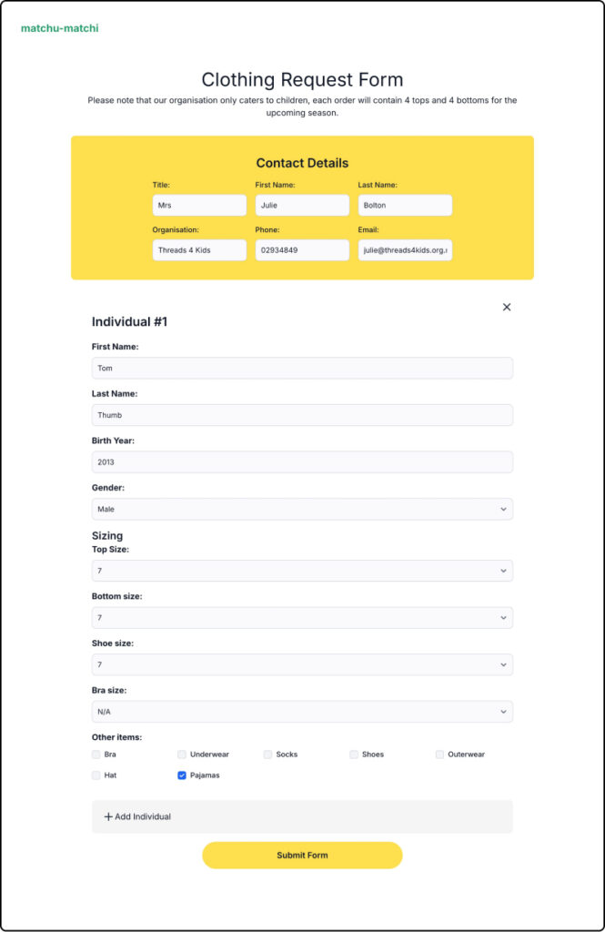
Representatives from partnering organisations who fill in the details of clients on the clothing request form.
Context of Use (Conditions and Circumstances)
Users, especially volunteers are not likely to have a desktop computer in with them while packing and sorting clothes. Requiring them to take down notes on a piece of paper before inputting them into a computer defeats the purpose of the system. Therefore it is important for the design to be fully responsive for phones and tablets.
The App
The GUI:
Bright and cheerful colours were used, evoking hope and the innocence of childhood. I chose to keep the design minimalist so as not to distract users from the form, as the main purpose of the webapp to act as an add-on to the charity’s website. The assumption is that the charity’s main website would have done the job of attracting users and building trust.
Design & Logic:
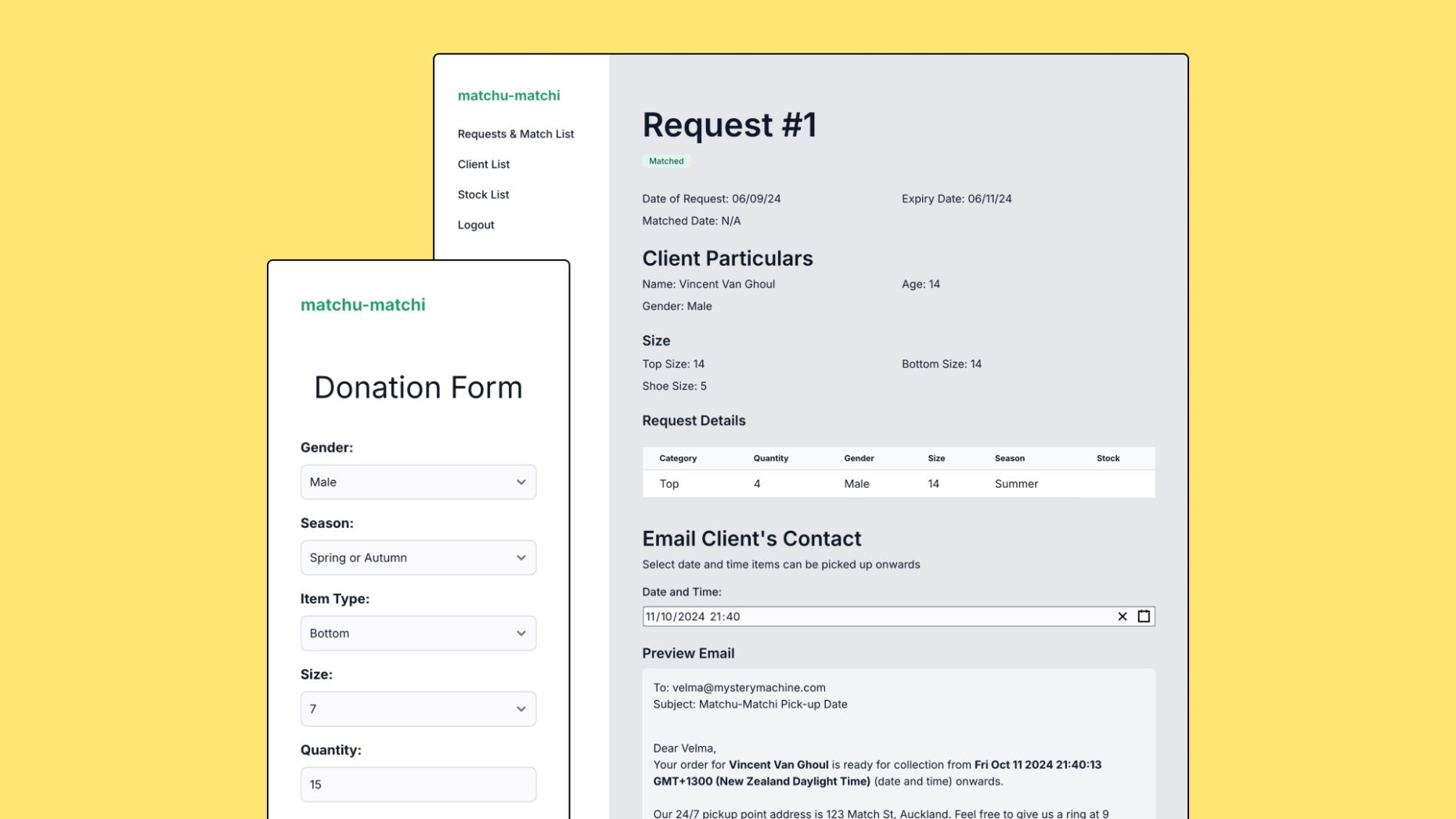
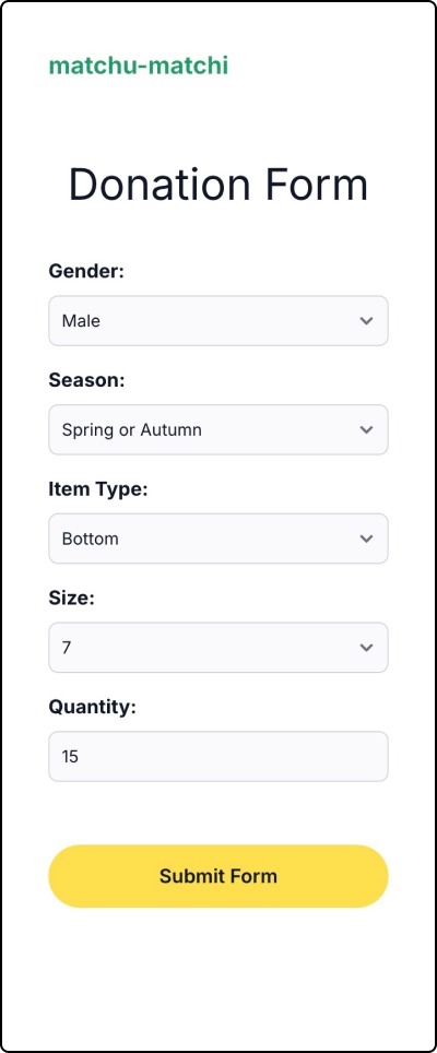
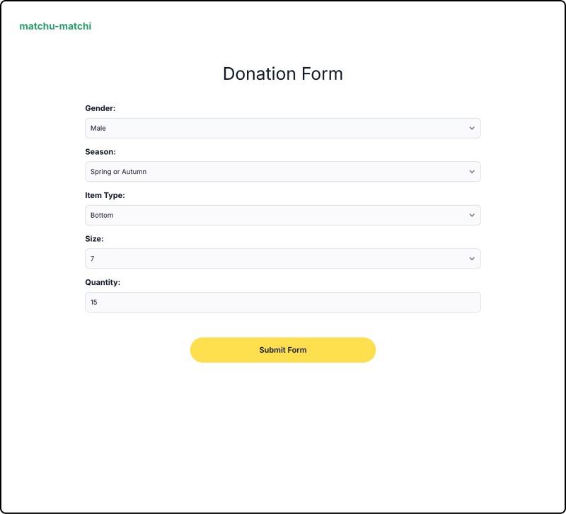
Volunteers, as they go about sorting through donations are able to log the classifications of the clothes received.
Contacts log their details into the form along with their client(s). As one contact may have multiple clients, they can add more than more individual to their application. Each individual generates one request.
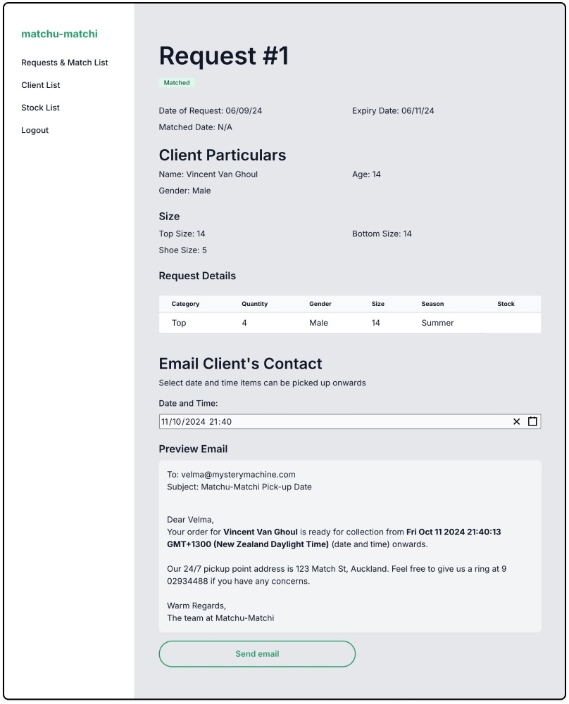
The request and matching page is probably the most important one in the entire webapp, which is the page the admin sees upon logging in. They have a quick overview of the most important information, including the statuses of the matches, which are colour coded for quick scanning.
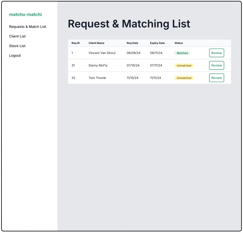
New requests are marked as ‘Unmatched’ by default.
When there are enough items of the correct size, season, gender and category in stock, the system shows that all items are in stock in the request page, and the admin has the option to mark as ‘Matched’.
In an earlier design the preview email page was separate from the request page, but I chose to appear under the request when the status is ‘matched’ so that the admin can choose to send the email without having to load another page, saving them one click. Sending the email will automatically mark the status as ‘Packing’.
After the items are put at the pickup location, the admin can then mark the request as ‘Fulfilled’.
Usability:
The system needed to be simple enough for users to navigate from the outset, without requiring extensive training. This is important for non-profits as they aim to direct as much time and funds as possible to their mission.
To achieve this, I emphasised consistency in the design so that the design was well structured and easily scannable. Using modern interface design principles, I designed the system to function in a way that users would intuitively expect.
All colour combinations were all WCAG compliant to ensure that users with partial or low vision can access information on the application.
To validate the system’s usability, I invited testers representative of the end-user demographic to independently explore the application. They were provided links to access the system, and feedback indicated that “on the whole [the application] is easy to use” and intuitive. Testers didn’t encounter any issues and were able to complete all tasks without needing external assistance.
Summary
The strengths of the system are that it improves the efficiency and security for an organisation through the automated matching system, ease of use and a secure backend which restricts access of sensitive information to admins.
However, the system is currently limited as it is customised to the specific needs of the Caring Closet, from my case study. If the organisation decided to make changes to their form or the way their service is provided, the system would need to be changed by a developer.
Admittedly, there are also many things I would have liked to implement given the time that would further improve the user experience of the system. This includes specific search tools for clients and stock, modals and pagination, and functions such as a notification that informs the admin when stock for an item is low.
Ideally, I would like non-profit organisations to be able to make use of the system I built in some capacity. As the main issue of usability comes down to the customisation required to meet the unique needs of other organisations, one approach would be creating a no-code form builder where non-profits can customise forms to their needs. Alternatively, I could offer a service to customise the code and matching system, using my project, Matchu-Matchi as a base.