Fish Finder Chartplotter Multifunction Display Case Study
Role: UI & UX Design
Tools: Balsamiq
Year: 2024
The product
The Fish Finder Chartplotter MFD is used by recreational boating enthusiasts who use small boats for fishing. The chartplotter MFD system is similar to a navigation system found in many modern cars, but displaying nautical charts instead of street maps.
Features
- A “fish encyclopaedia” component which allows anglers to search for a fish that they have sighted or caught.
- Log past catches of a specific species of fish,
- See locations of past catches and see possible locations of fish on the screen.
Context of Use (Conditions and Circumstances)
The user will be using the system outdoors on board a moving boat, in possibly messy, unideal situations.
Small buttons and text were avoided in the design, and overflow text avoided as much as possible. All selections could also be done by using the hardware buttons on the display. I did away with having to type in phrases, for example to search, choosing to use filters and images instead.
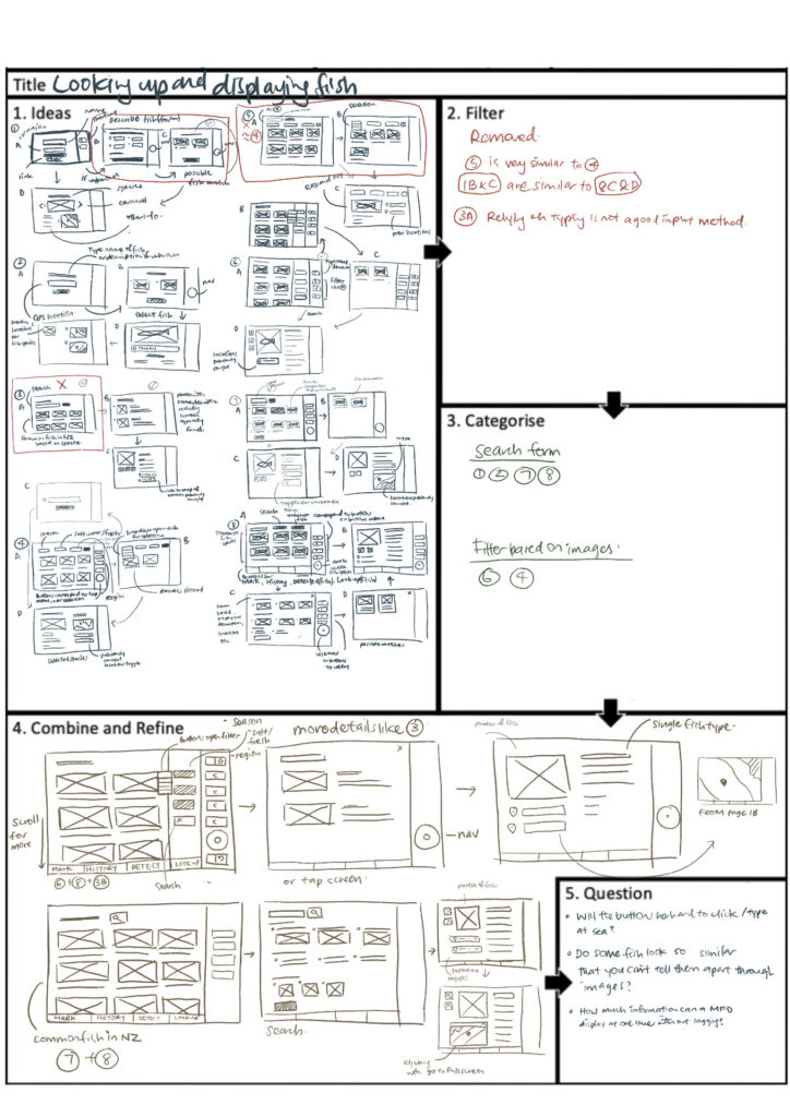
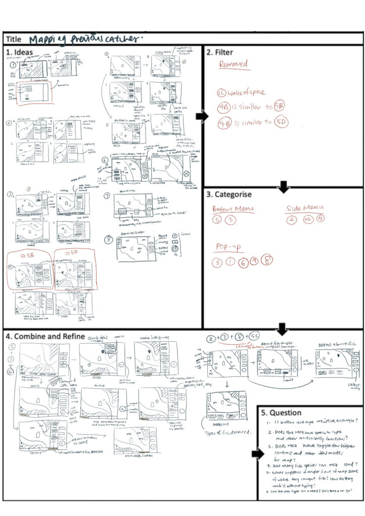
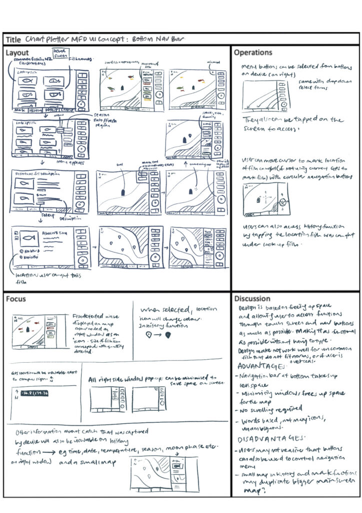
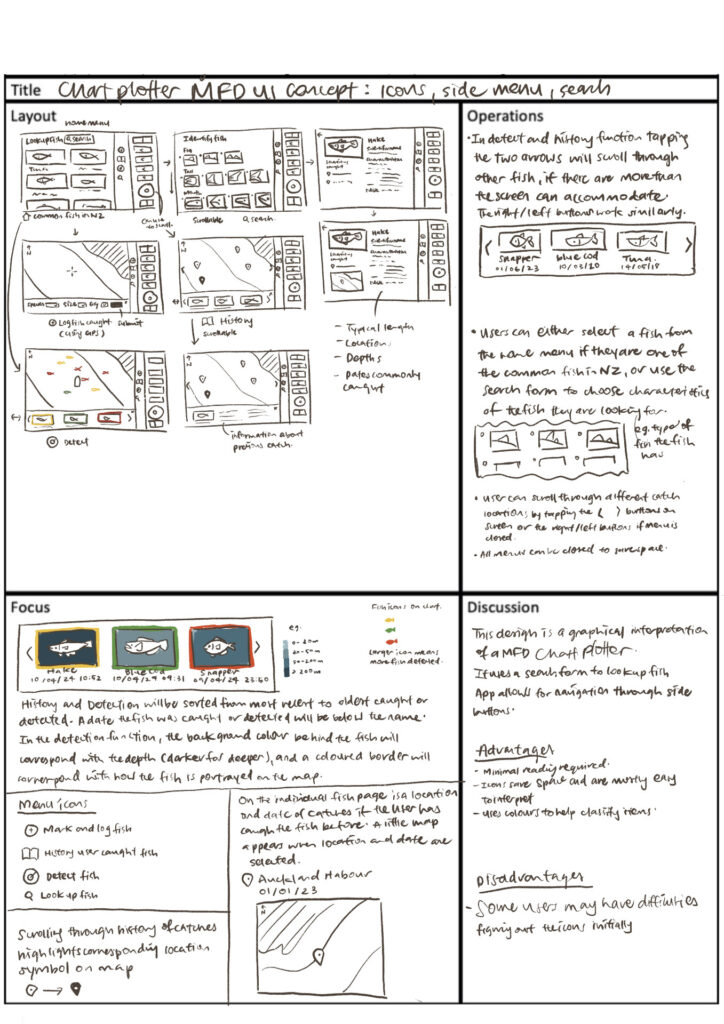
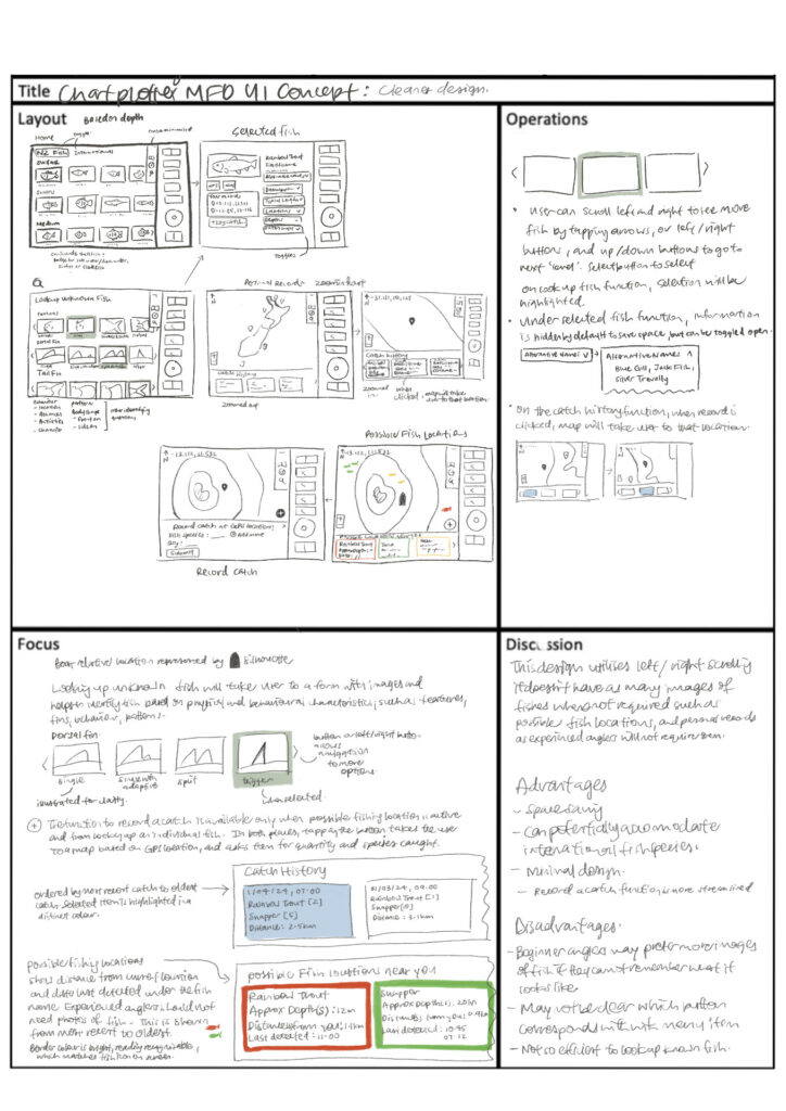
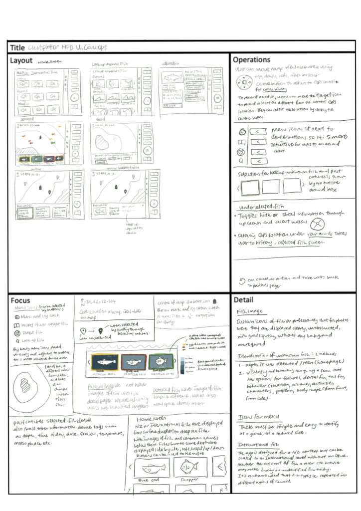
Brainstorming: Paper Wireframes
I brainstormed alternative ideas using the Five Sheet Design Process (FdS) methodology.
Final Design on Balsamiq
Home screen (Lookup Known Fish)
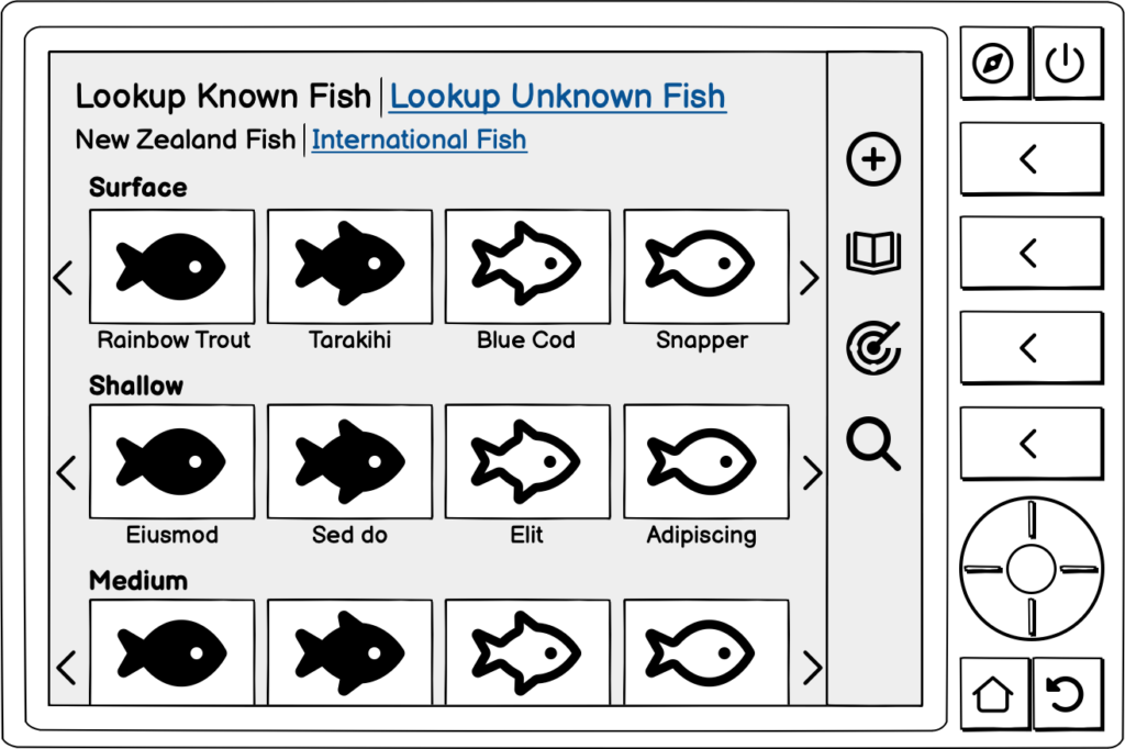
This page will have images of different fish, categorised based on the depth they are typically found, with a good quality image above the name of the fish in which it can be seen clearly.
In the header, there are two links for New Zealand fish and International Fish, which the user can toggle to based on their location.
Clicking on the image or name of the fish will take them to the fish details page.
Users can scroll through the various fish using the side arrows or physical buttons and select by tapping or using the physical select button.
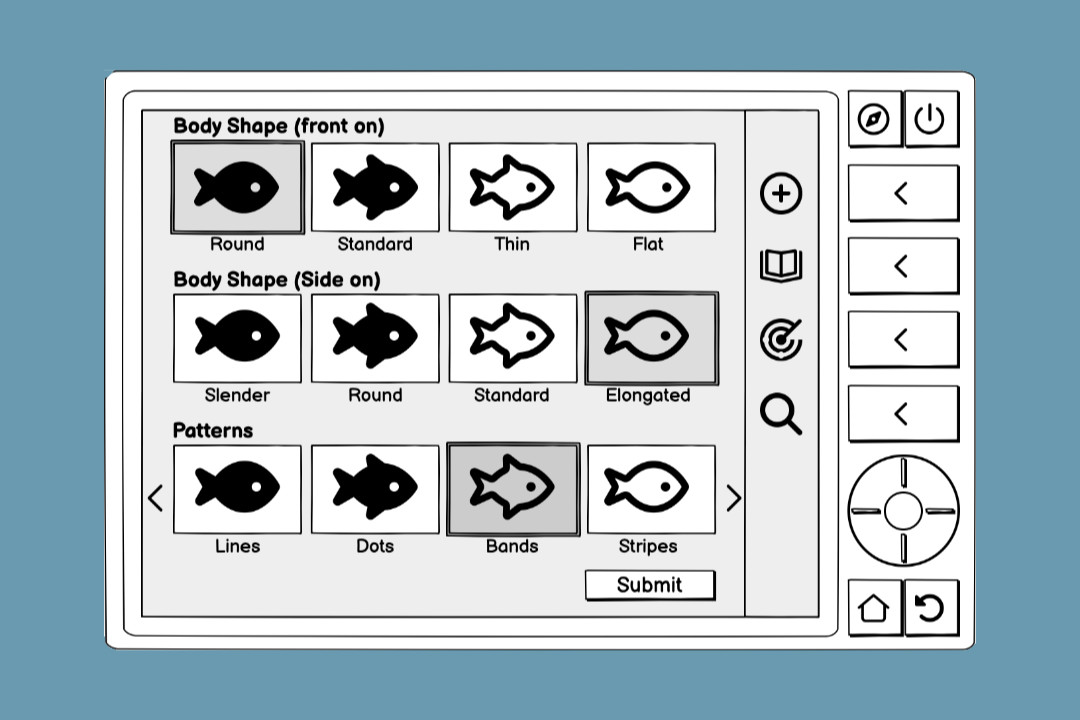
Lookup Unknown Fish
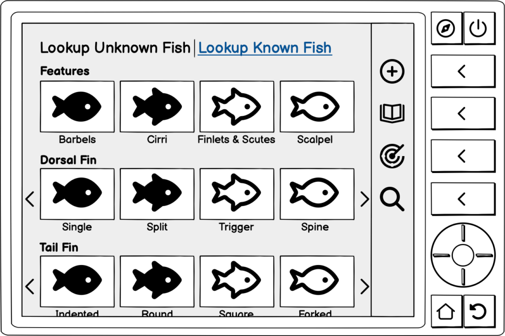
Users can select the physical appearance of the fish they saw or caught.
Similar to the homescreen, users can toggle through the options using the arrows or physical buttons, and select by tapping or using the select button.
The images above the descriptive words are high quality images of the physical feature.
More than one possible result
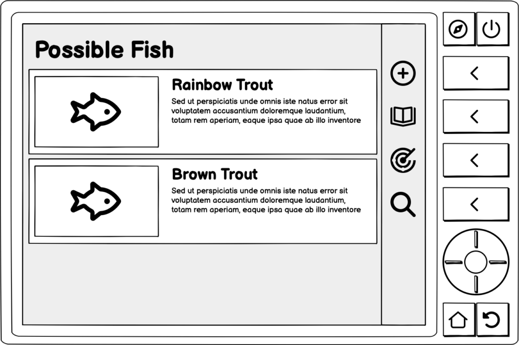
Users may find that more than one fish matches their search.
In those rare cases, different possible fishes will be shown with a clear photo of the fish, their species name and a short description about their usual location and times sighted so anglers can narrow down which fish is more likely to be the one they are looking for.
Selected fish view
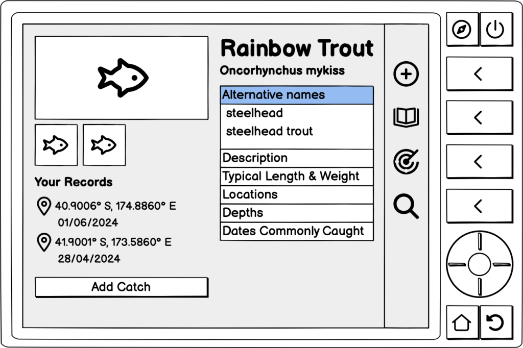
Users arrive on this page either by selecting a fish from the homescreen or through the Lookup Unknown Fish function.
Information about the fish includes
- Photo(s)
- Common name and scientific name
- Alternative names
- Description
- Typical length and weight
- Locations this species is found in, for the angler’s current country
- Dates these fish are commonly caught
- Locations and dates that the angler previously caught the fish (if applicable)
Using the up and down physical buttons or tapping the screen toggles the accordion open.
Users can click the locations and dates under “Your Records” to go to the history function, which features a map showing where the angler has previously caught fish.
Add a catch button allows the user to record a catch of a specific fish species based on their current gps location.
Possible fish locations on the catch map
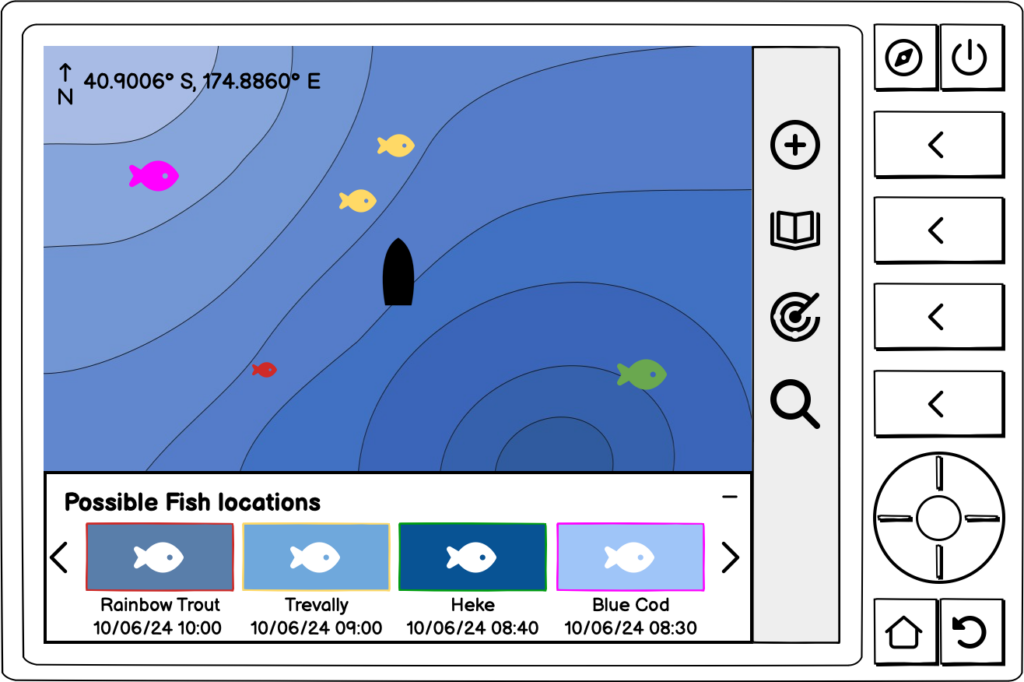
User arrives on this function by clicking the radar icon on the menu or the corresponding button.
At the bottom of the screen is a window that shows images and names of fish that the MFD has detected, as well as the date and time it was last detected. The background of the image has different shades of blue, which references the fish’s depth it was detected. A darker blue means that the fish was detected in deeper waters compared to a lighter shade which represents shallower waters.
Fish are ordered by when they were detected, from the recent to the more historical detections.
Users can toggle through the different fish detected using the arrows or physical buttons. They can also select the fish using the select button or by tapping on the image.
Selecting the fish takes the user to the fish information page.
There is a coloured border around the images of the fish. This corresponds to the icons of the fish on the map for quick reference. Fishes on the map have different sizes, which corresponds to the size or quantity of that fish detected.
The possible fish locations window can be minimised at the user’s discretion by clicking the top part of the window.
Map showing angler’s previously caught fish.
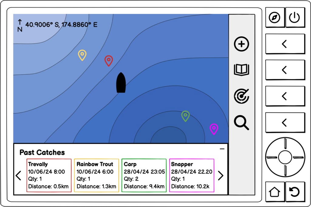
The past catches window shows the species, date, time, quantity and relative distance from the angler’s current location. The border around this information corresponds with the location icon on the map.
Locations are ordered by how close the location is to the angler’s current location, from closer to further away.
Users can toggle through the different fish detected using the arrows or physical buttons. They can also select the fish using the select button or by tapping on the image.
The window can be minimised at the user’s discretion by clicking the top part of the window.
Record Catch
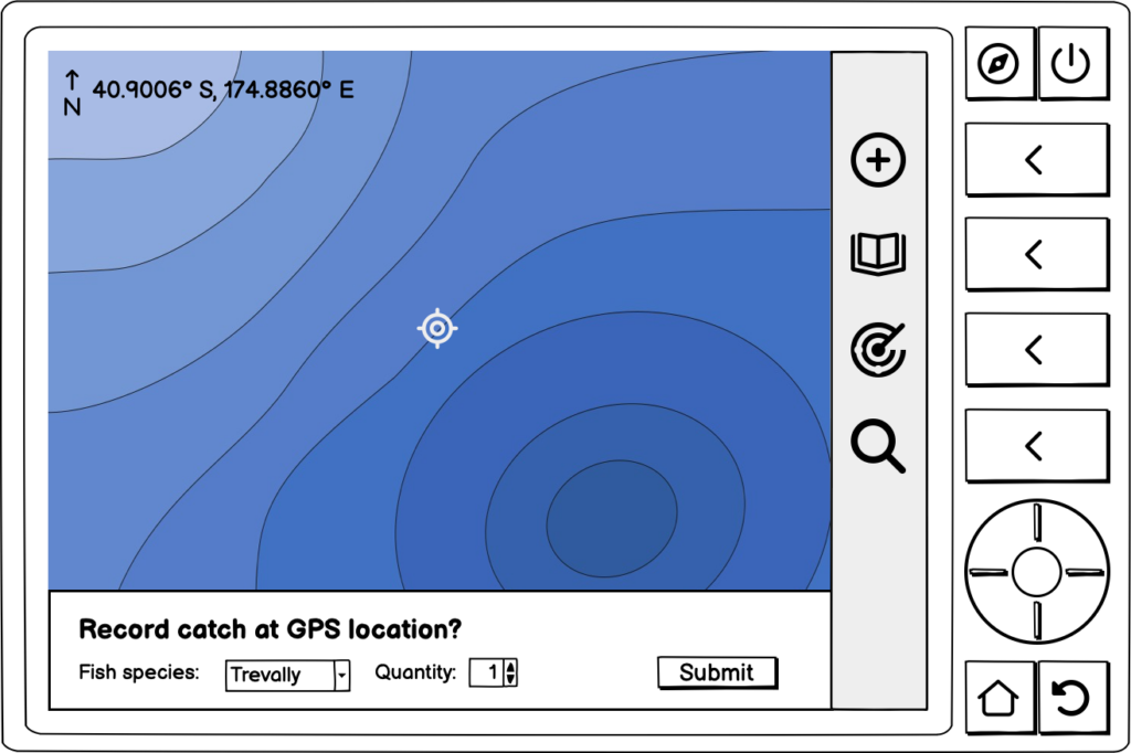
Users access this page either from the fish information page or by clicking the plus sign with the circle around it, or the corresponding physical button.
Users can select the fish species from the drop down menu. They can toggle it using the physical buttons.
Clicking submit will take users to the past catch page where they can see their new record.
Summary
I found using the FdS methodology useful in creating alternate ideas, which is similar to sketching out various iterations on paper which I have done on previous designs. Designing app for anglers despite never having been on a fishing trip, let alone a fishing trip on a boat before proved to be a challenge of the imagination. So it was helpful that the brief gave examples of the kind of conditions that anglers might use the app.
As most common UIUX designs tend to revolve around mobile phone apps or websites for the desktop, so it was a fun departure to design something so niche and out my context.